Lies, Damn Lies and Lib Dem Statistics!
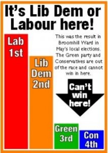
 As a maths teacher I am always looking for examples of graphs that have been drawn incorrectly to misrepresent the data. I don’t think I have ever seen one quite as bad as this one, currently on the Broomhill page of the Sheffield Liberal Democrats website.
The actual result for this election was as follows.
| Candidate | Party | Votes | Percentage |
| Stuat Wattam |
Labour | 1741 | 34.6 |
| Bernard Little |
Green | 1315 | 26.1 |
| Michael Ginn |
Conservative | 505 | 10.0 |
| Alan Whitehouse |
Lib Dems | 1371 | 27.2 |
| Sullivan Pat | UKIP |
104 | 2.1 |
| Total |
5036 | 100 |
Electorate: 13312
Turnout: 37.8%
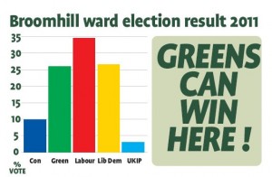
The Lib Dem Graph makes it look as if the Greens had about one quarter of the votes of the Lib Dems, when in fact the Greens polled 1315, which is 96% of the Lib Dem vote. The Greens got more than double the Conservative vote, but the graph makes them look very similar. Compare this to the graph on the Green Party website which looks like this.
With the current unpopularity of the Lib Dems and Labour it is perfectly clear that the Greens could win this election, which is why the Lib Dems have resorted to such unfair and devious tactics.
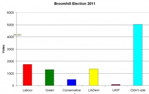
We could redraw the graph again to put a very different spin on it.
So the people that are disillusioned with the main political parties and don’t bother to vote are actually the massive majority! If just a small proportion of them choose to vote for one of the parties, that party will clearly win! The election of George Galloway in Bradford and Caroline Lucas in Brighton has clearly shown us that small parties can and do win. Don’t believe the misrepresentations of the Liberal Democrats who tell us nothing can change. Go out and vote on Thursday for the Green Party and you will begin to see real changes at the Town Hall.


